An introduction to conceptual and editorial illustration
An editorial illustration is an artwork that sits alongside a text in a magazine, journal, newspaper or online platform with the intention to reflect and build on the words in order to convey an idea or theme. Covering wide ranging topics from social justice to book reviews. Some editorial illustrations may illustrate a scene, moment, or narrative, but for now we’re going to focus on artwork that has a conceptual edge.
Conceptual artworks tend to lend themselves particularly well to an editorial context because the aim of the image is to reflect and build on a text in order to convey an idea or theme. Through the use of visual metaphors, you can distort the texture of reality by undermining the logics that hold it in place. This allows you to illustrate intangible things, such as feelings or theories. In turn creating emotive imagery that carries narrative can engage understanding or empathy within an audience.
Check out my blog post on how to generate illustration ideas here.
“Through the use of visual metaphors, you can distort the texture of reality by undermining the logics that hold it in place.”
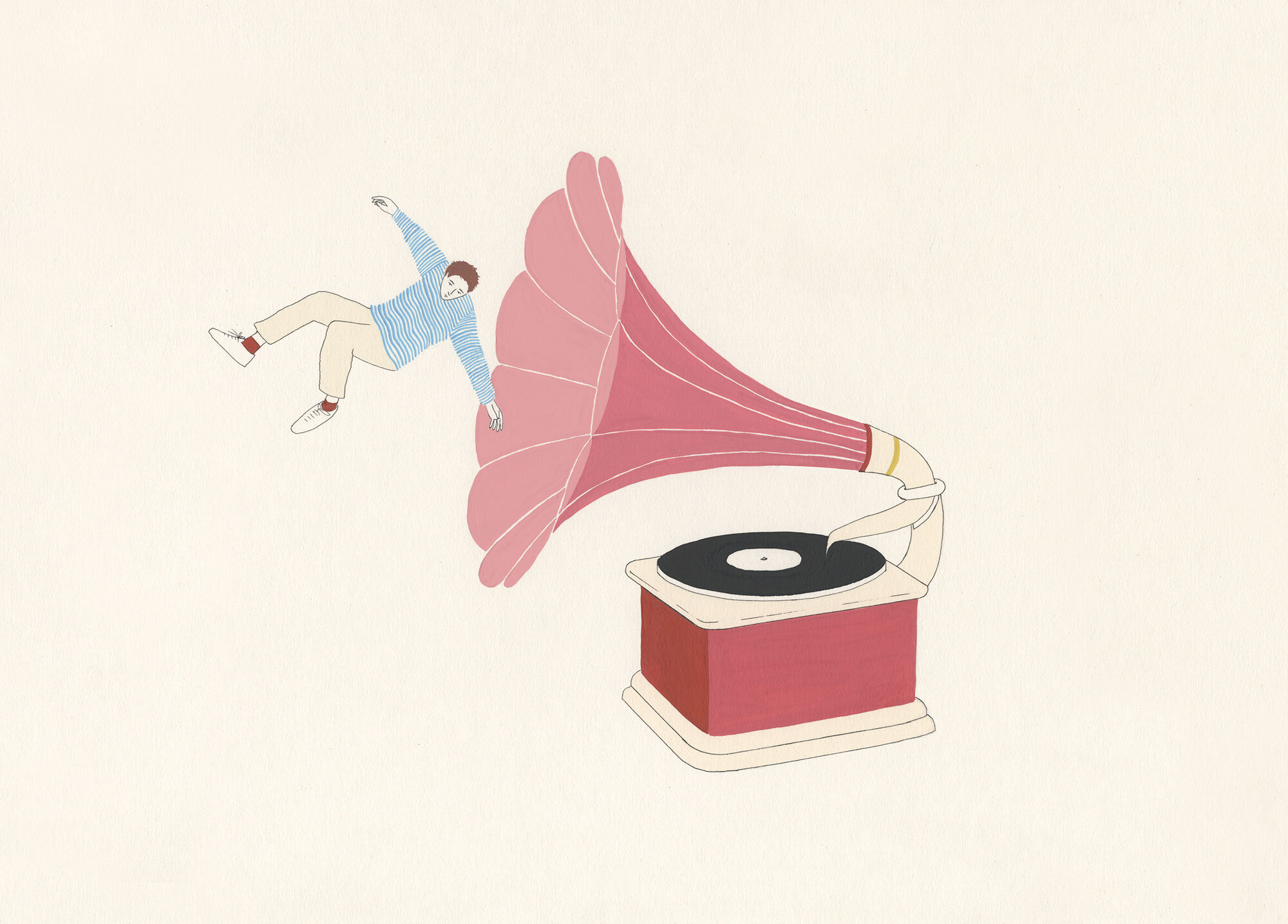
These artworks were commissioned by The Wellcome Trust to accompany an article about sensory processing disorder; a medical condition in which people affected can perceive touch to feel like sand paper, a gentle glow to feel like a spotlight, and everyday sounds to hurt.
Conceptual illustration presents the viewer with a puzzle and creates an appealing experience to interpret the artwork alongside the text. I think there’s an art to being precise, by giving less information it can invite the audience to inhabit a shared imagined landscape. Brian Eno describes it succinctly:
‘Creating work that is too didactic, belittles the audience because it says to them, you are going to take away exactly what I put in, and what I always think is much more interesting is to plant a seed in somebodies mind for it to grow into what ever their mind wants it to grow into. To accept that they are co-creators essentially.’ (The Adam Buxton Podcast. EP. 38 - Brian Eno Part Two. Source: Adam Buxton Podcast)
“Shock imagery can be disengaging to an audience, therefore there is power in handling the subject matter sensitively.”
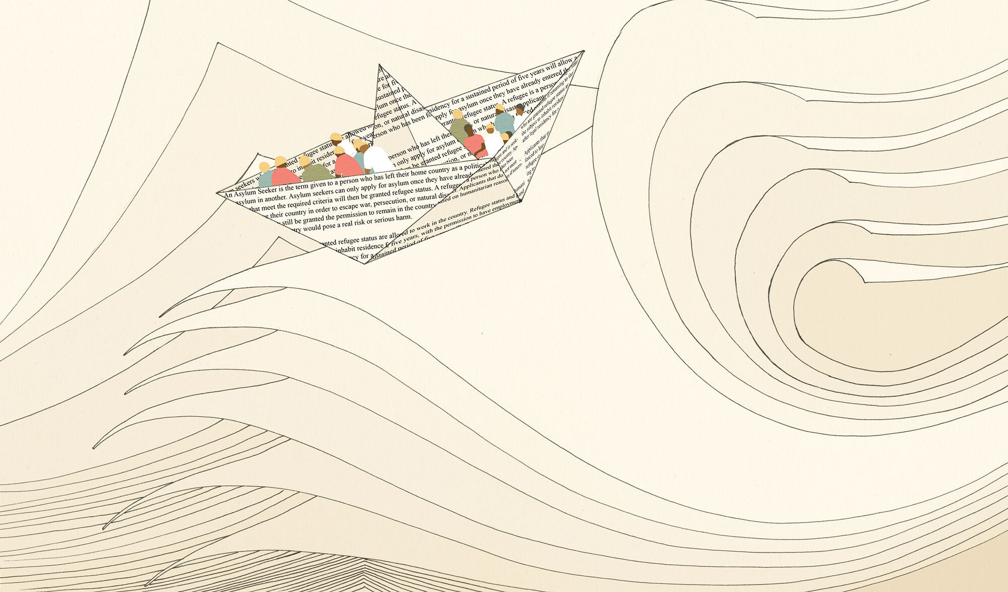
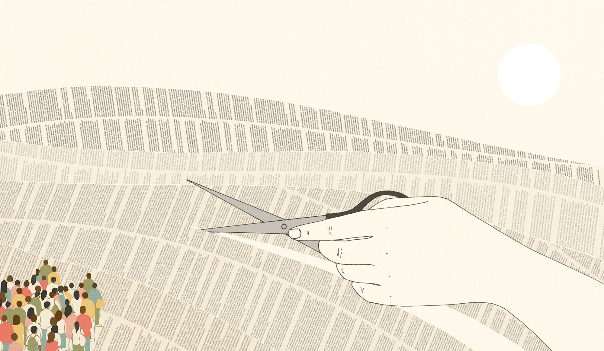
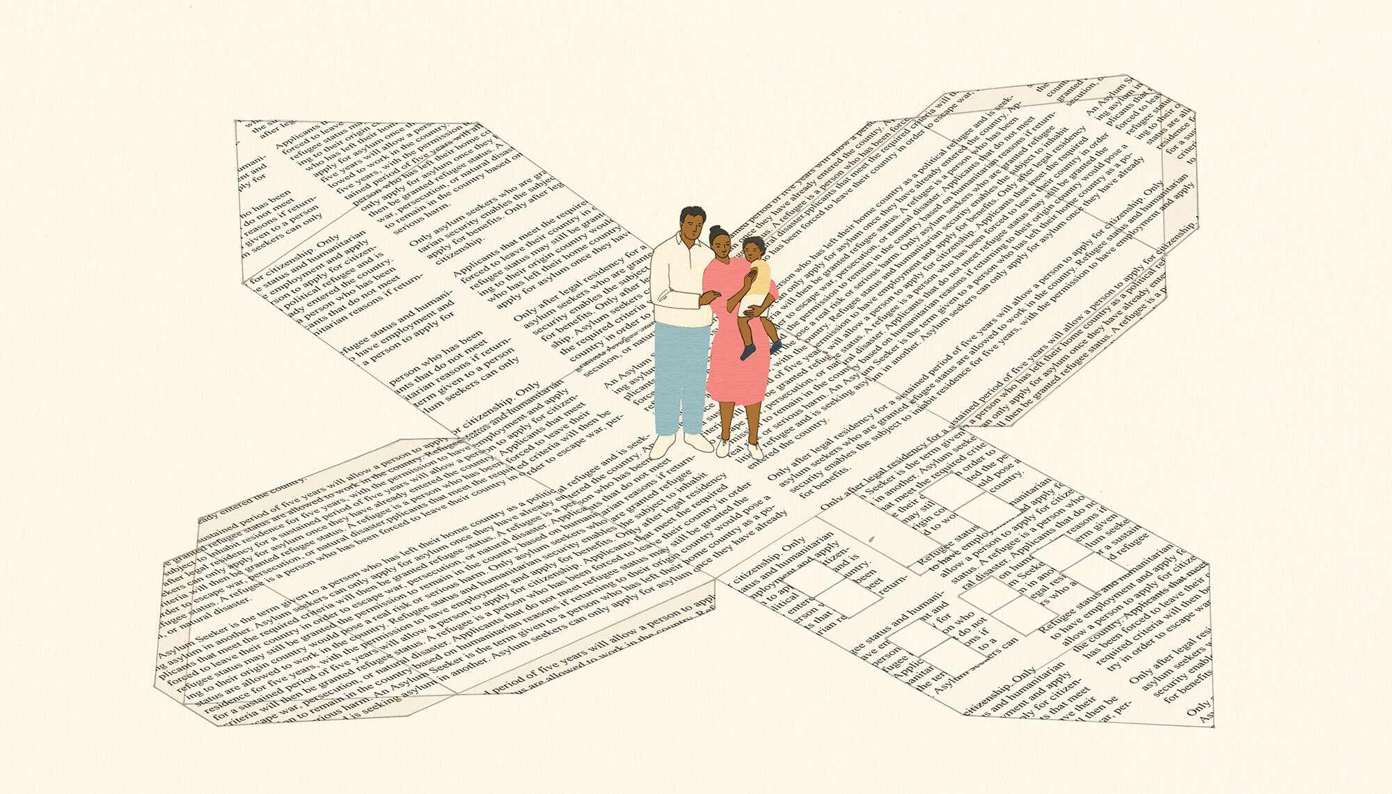
Creating visual metaphors can also enable you to approach difficult topics with sensitivity. These illustrations were made for CNN to accompany an article written by David Miliband about the importance of protecting refugee rights by withstanding change to legislation and policies. The concept behind the artwork is that the paper policy (depicted as a ship, landscape and house) conveys the fragility of the situation that refugees are faced with in light of legislation changes. Illustrating the sad reality of the refugee crisis and the dangerous journeys migrants make, would be too harrowing to depict directly. Shock imagery can be disengaging to an audience, therefore there is power in handling the subject matter sensitively. Illustrating a scene that’s close to the truth yet incorporates an imaginary and metaphorical element, creates a palatable image that highlights the reality but can also engage an audience to empathise with an experience that is outside of their own.
You can learn about how to create conceptual illustrations, develop a visual language and generate ideas on my new course. Watch the video below or read more here.
